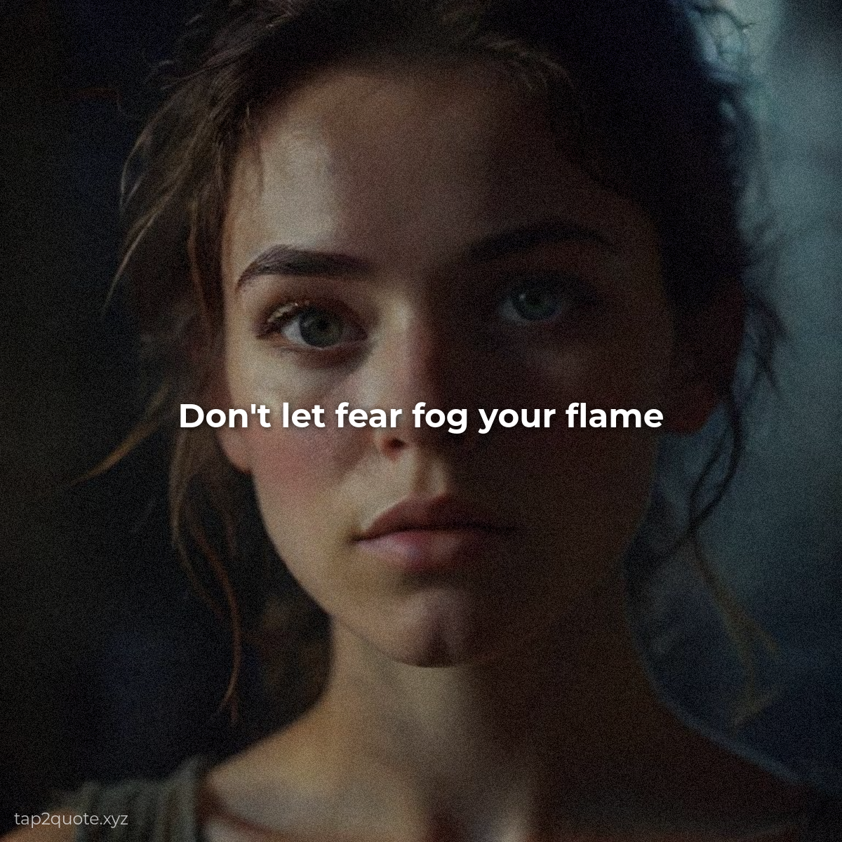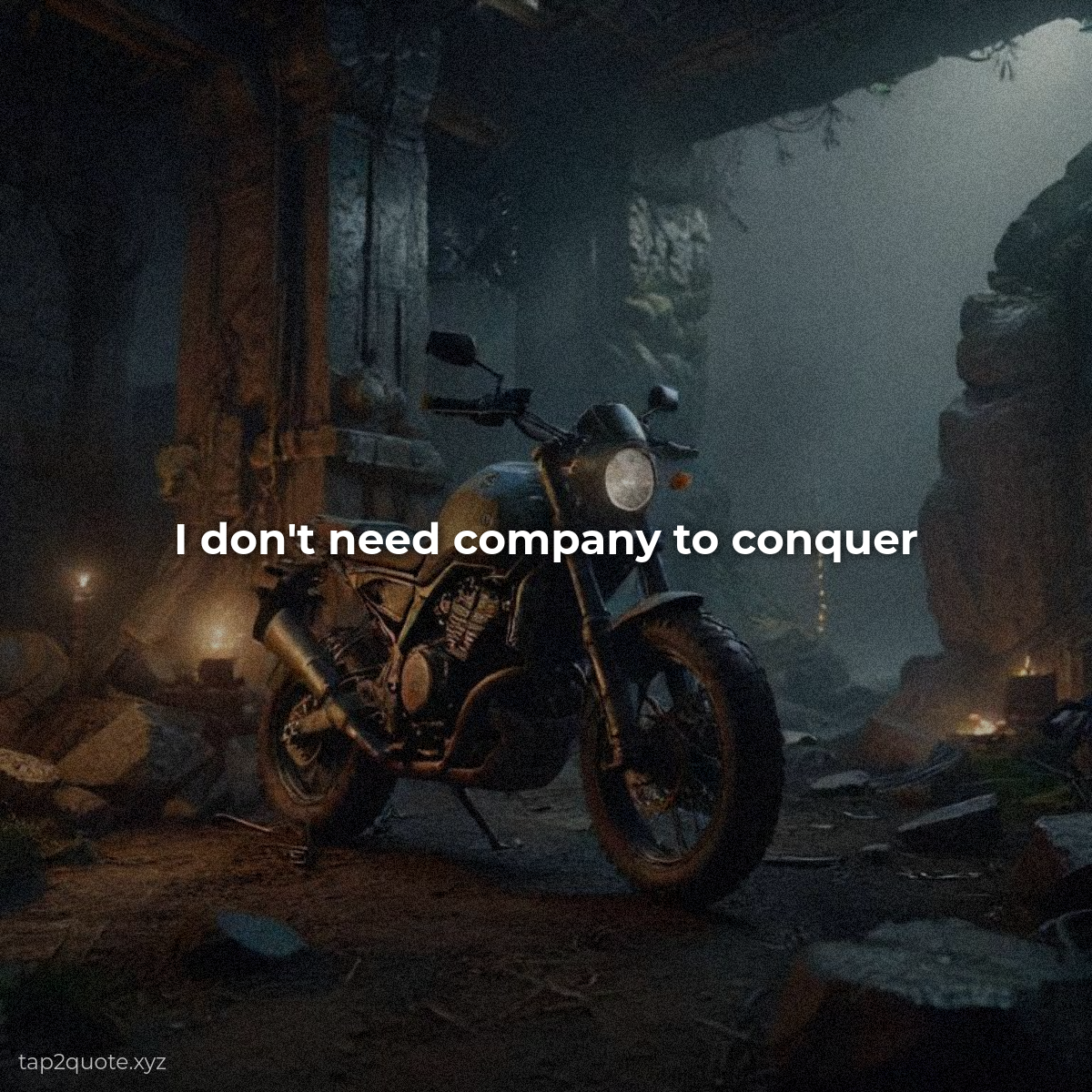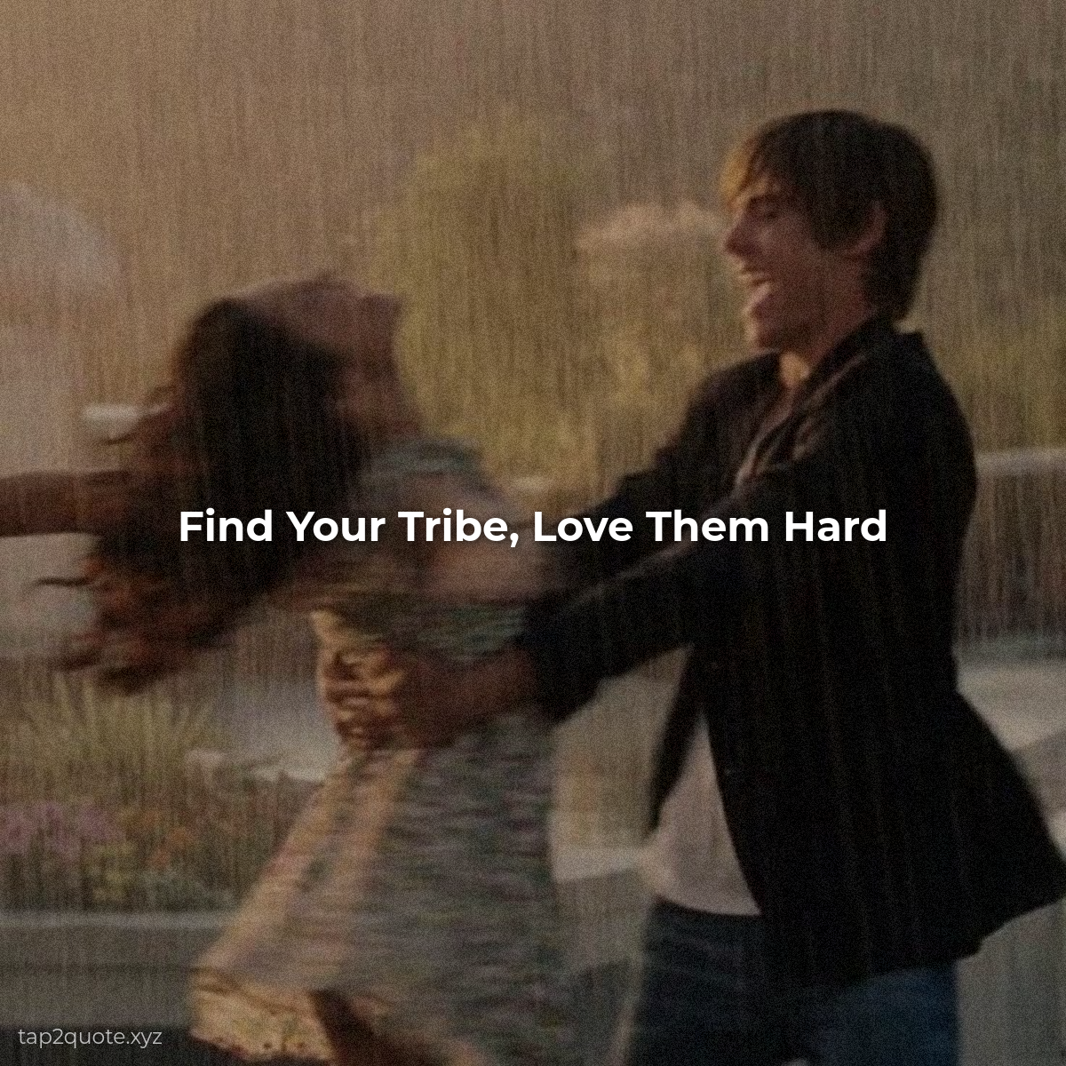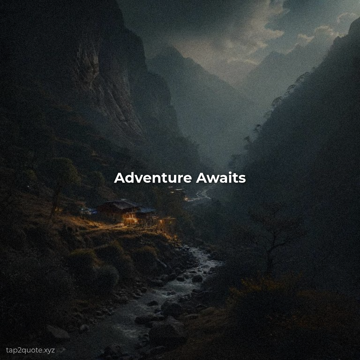
I spent most of a year making square quote images before I questioned why. Not because squares were good. Because they were the default, and defaults are comfortable. Scrolling back through my own archive is a little embarrassing now — every single post locked in that 1:1 box while the feed around me had moved on.
The square was never chosen. It was required.
Instagram launched in 2010 with a fixed square format, and for years it was the only shape allowed. Designers built everything for the square because they had no choice. That distinction matters: the square wasn't chosen for being good. It was just the only option. A lot of design habits you still see today are leftovers from constraints that no longer exist.
Two things changed
First, Instagram and every major platform started accepting multiple aspect ratios, so the square lost its monopoly. Second — and this is the bigger one — feeds went vertical. People scroll down, and portrait images fill the screen while they do, which means more time spent stopped on your post.
The result is predictable: portrait formats now outperform squares, because the screen is vertical and the format finally matches the behavior. The square still works. It's just no longer the best tool for the job.
What actually works now
- 4:5 — the sweet spot. Taller than a square, takes up most of the screen, no awkward cropping on mobile. The modern default for feed posts.
- 2:3 and 3:4 — even taller, great for Pinterest and stories-style content.
- 9:16 — full screen. Built for stories, TikTok, and Reels.
One place the square still earns its keep
Profile grids. A tidy grid of squares looks clean and professional when someone visits your profile. That's why a lot of creators design in 4:5 but keep the design strong enough to hold up as a grid square, or just post some squares for consistency.
Format follows platform, and platform follows behavior. People scroll vertically, so give them vertical images. Don't stay in the square out of habit — pick the shape that matches where your content is actually consumed. It's a small change, and it's the single fastest way to make your feed feel modern.