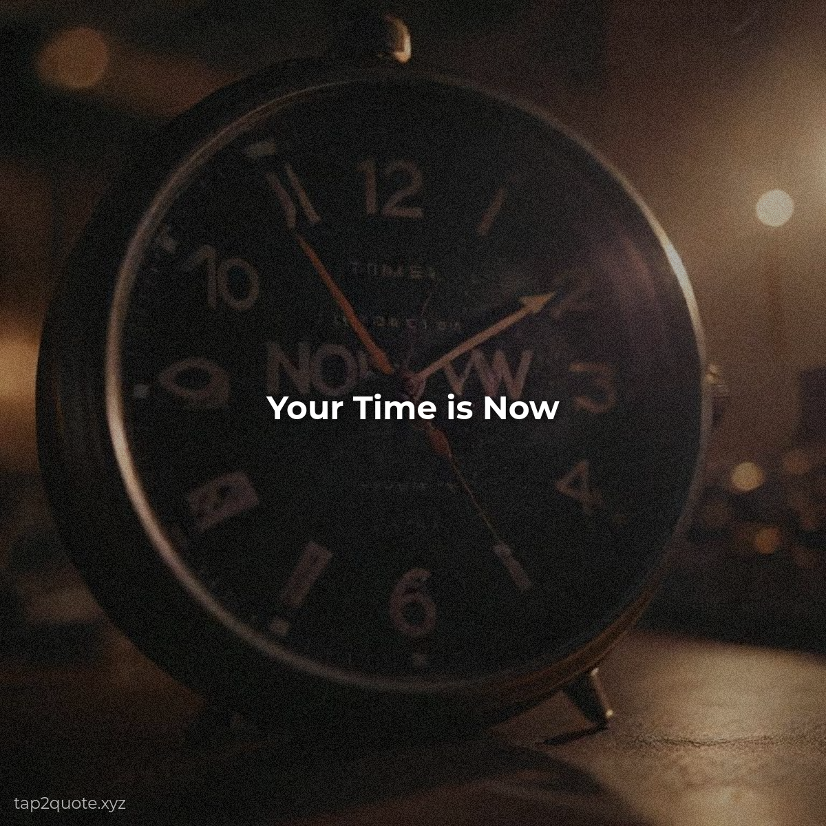
I've made this mistake more times than I'd like to admit: found the perfect photo, placed the quote, exported, and then couldn't read it. The text just disappeared into the background. It's the single most common reason quote images fail, and it's also the easiest to fix once you know the tricks.
Every technique below I learned the hard way — by exporting the failure first.
Technique 1: The dark overlay
My default move. Place a subtle dark layer between the photo and your text: a soft dark rectangle or gradient, maybe 30-50% opacity. It doesn't change the photo's feel much, but it instantly makes white text readable. When in doubt, use the dark overlay. It works because it gives your text a consistent, predictable surface.
Technique 2: Text shadow and outline
A subtle drop shadow or a thin outline around your letters separates them from whatever's behind them. This is the cheapest legibility hack in existence. Don't go overboard — a hint of shadow does the job; a heavy glow looks like 2007.
Technique 3: Pick the right text color for the photo
This sounds obvious, but people skip it constantly. Study the photo. Is it mostly dark? Use white text. Mostly light? Use dark text. The photo is the boss. Text color follows the photo, not your preference.
Technique 4: The contrast check
The trick I use on every single image before exporting: shrink the preview to the size it would appear on a phone screen, then look at it with squinted eyes. If the text still stands out, it's good. If it blurs into the background, I fix it right there. The squint test sounds dumb. It catches more bad images than any tutorial I've read.
Or just simplify the background
Sometimes the fix isn't adding more to the image. It's removing. A clean, simple background does more for legibility than a hundred overlays. If a photo is so busy that text can't win, it's the wrong photo. Let it go.
Legibility isn't a design choice. It's the entire point. An unreadable quote image isn't artistic. It's broken. Fix the legibility first, then make it beautiful.