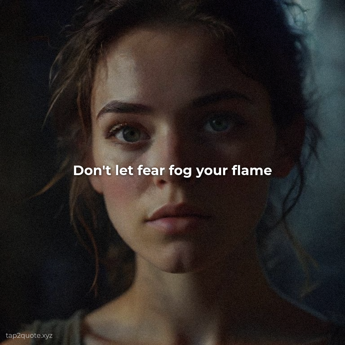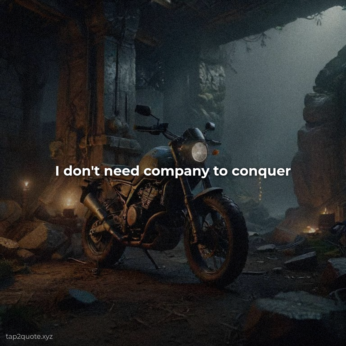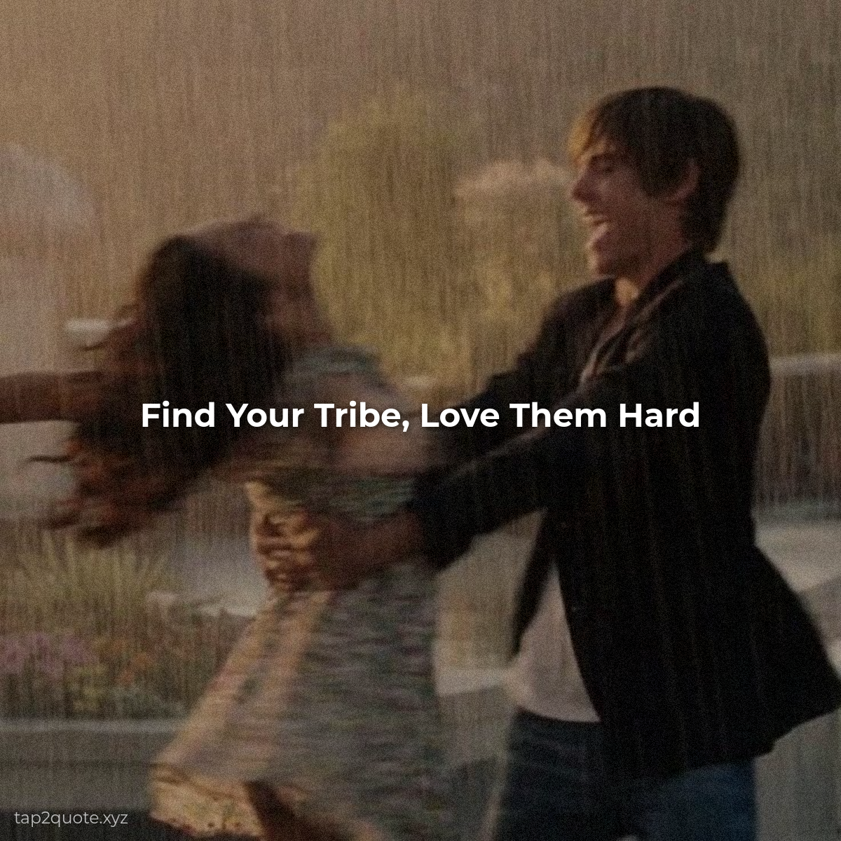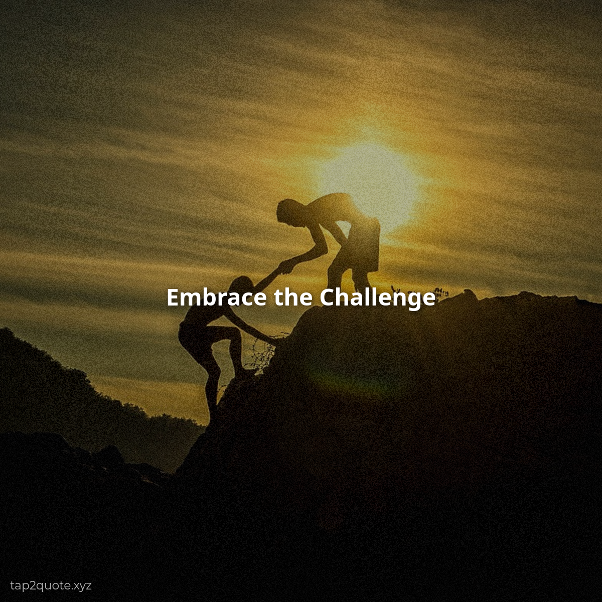
I used to be terrified of empty space. Every frame I built had to be full — a background, decorative flourishes, the quote, maybe a smaller quote, a border, my handle at the bottom. By the end nobody could tell me what the image was even about. Everything shouted at once, so nothing got heard.
That's the mistake that sinks most quote images, and I made it for months before I figured it out.
Why empty space wins
Give your text room and it becomes the only thing the eye can land on. That's basically the whole job. The quote images I'm proudest of are almost always the emptiest — one line, a ton of air, done.
There's a confidence thing going on here too. Leave most of the frame blank and you're telling the viewer the quote is worth their attention all by itself. Crowded design is a nervous tic. Minimal design is a statement.
How much space is enough?
My rule of thumb: text should take up no more than a third of the image. The rest is breathing room. If your quote is eating half the frame, you've got two options — cut words, or shrink the text until it sits comfortably.
On a phone this matters double. Cramped text reads as noise, and people scroll past noise without a second thought.
Space does double duty as a hierarchy tool
Give the main quote lots of room and the attribution a little less, and you've quietly told readers what to look at first. The eye drifts toward the largest, best-spaced element. That's free navigation for your viewer.
What to cut
When an image feels busy, I run a trimming pass and ask each element one question: what is this doing here?
- Decorative elements that don't carry the message — gone
- The quote itself — cut down to its most powerful line
- Borders — keep them only if they're earning their place
- Extra words — most of them are optional anyway
The test
Step back from the finished image and ask yourself: is there anything in this frame that isn't helping? If yes, delete it. You're not aiming for a full frame. You're aiming for one confident message with nowhere else to look.
Empty space isn't empty. It's the frame around the picture, and the frame is part of the picture.