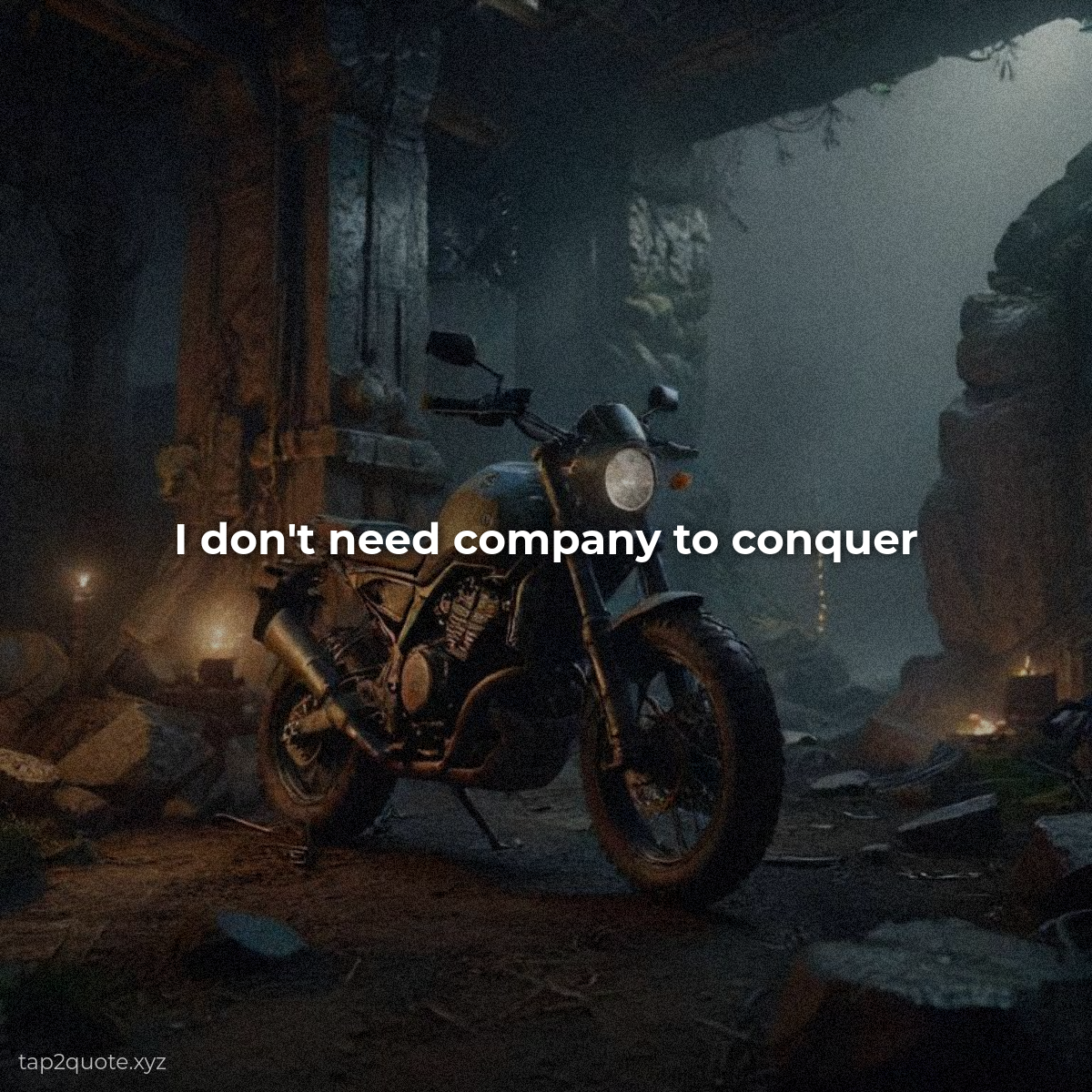
A font can ruin a good quote faster than almost anything. You type out something beautiful, pick a typeface you love, hit export — and the image looks wrong in a way you can't name. Not bad. Just wrong.
I spent months working this out the hard way so you don't have to. Font choice isn't really about taste. It comes down to three things — mood, readability, and contrast. Get those right and you'll pick good fonts every single time.
Rule 1: Match the mood
Fonts carry emotion. A sharp, heavy sans-serif feels strong and modern — perfect for sigma or motivational content. A graceful serif feels classic and trustworthy — great for love quotes and wisdom. A playful script feels warm and personal, but use it sparingly, because it's the hardest to read.
Ask yourself one question: what should this quote feel like when someone reads it? Then pick the font that feels that way. Your gut knows. Trust it.
Rule 2: Readability beats style
This is the rule I break the most, and I always regret it. A font that looks gorgeous at full size turns into unreadable mush on a phone screen. When in doubt, choose the boring font. The quote is the star. Your font is the supporting actor.
Rule 3: Limit yourself
Two fonts per image, max. One for the quote, one for the author or small details. Mixing five fonts in a single image is how you end up with something that looks like a ransom note. I know this from a personal low point — every image I made for a month had four fonts, and looking back at them now still stings a little.
A few safe starting points
- Motivational: Montserrat, Oswald, Roboto
- Classic/wisdom: Playfair Display, Lora, Georgia
- Personal/warm: Lobster, Pacifico (use tiny)
These aren't the only good fonts. They're just the ones that rarely disappoint. Once you're comfortable, branch out and find your own signatures.
The 10-second test
Before you download any quote image, do this: shrink the preview to thumbnail size and try to read it. If you can't, the font size or style is wrong. Fix it and test again. Thirty seconds of this will save you weeks of posting unreadable content.