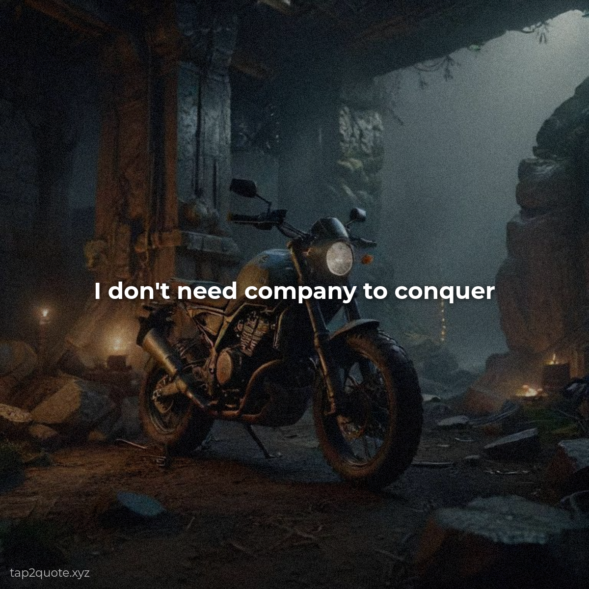
I once spent an hour picking a font for a single quote. An hour. I cycled through about forty typefaces, got a headache, and ended up back on the second one I'd tried. Somewhere in that hour I realized the problem wasn't indecision — I just had no system for choosing. Here's the system, and it's basically four buckets.
Serif — the classic
Serifs have little feet and flourishes at the ends of letters. Think Times New Roman, Georgia, Garamond. They read as classic, trustworthy, established — good for wisdom-style quotes and anything that should feel like it was written a hundred years ago. When a quote needs authority, reach for a serif.
Sans-serif — the workhorse
Sans-serif means “without serifs.” Helvetica, Arial, Montserrat. Clean, modern, direct. It's the safest choice in quote design because it's the most readable at a glance on a phone screen. If you're not sure what to use, a bold sans-serif is never wrong.
Script — the emotional accent
Script imitates handwriting — cursive, elegant, romantic. It adds warmth, which is why it's everywhere in love-quote content. But it's hard to read at small sizes. Use it for short quotes or a single accent word. Never for a long passage.
Display — the loud one
Display fonts are made to grab attention — bold, decorative, condensed capitals, unusual shapes. Perfect for one-word messages like “GRIND” or “PEACE” and short punchy lines. Use them sparingly. Their whole power comes from being rare.
How to pair them without losing your mind
Here's the rule that ended my font-hour habit: one display or script for the headline feel, one readable body font for the quote itself. Two fonts maximum. Add a third and it gets cluttered, no exceptions I've found. And match the family to the quote's era and emotion — classic wisdom gets a serif, modern confidence gets a sans, love gets a script accent.
Readability wins, always
The final check is boring and important: if a font is beautiful but hard to read at the size you're using, it's the wrong font. Font choice is mood; readability is the thing that can't be compromised. Pick a family that fits the feeling, pair it with something readable, and your quotes will start looking like they were designed on purpose.