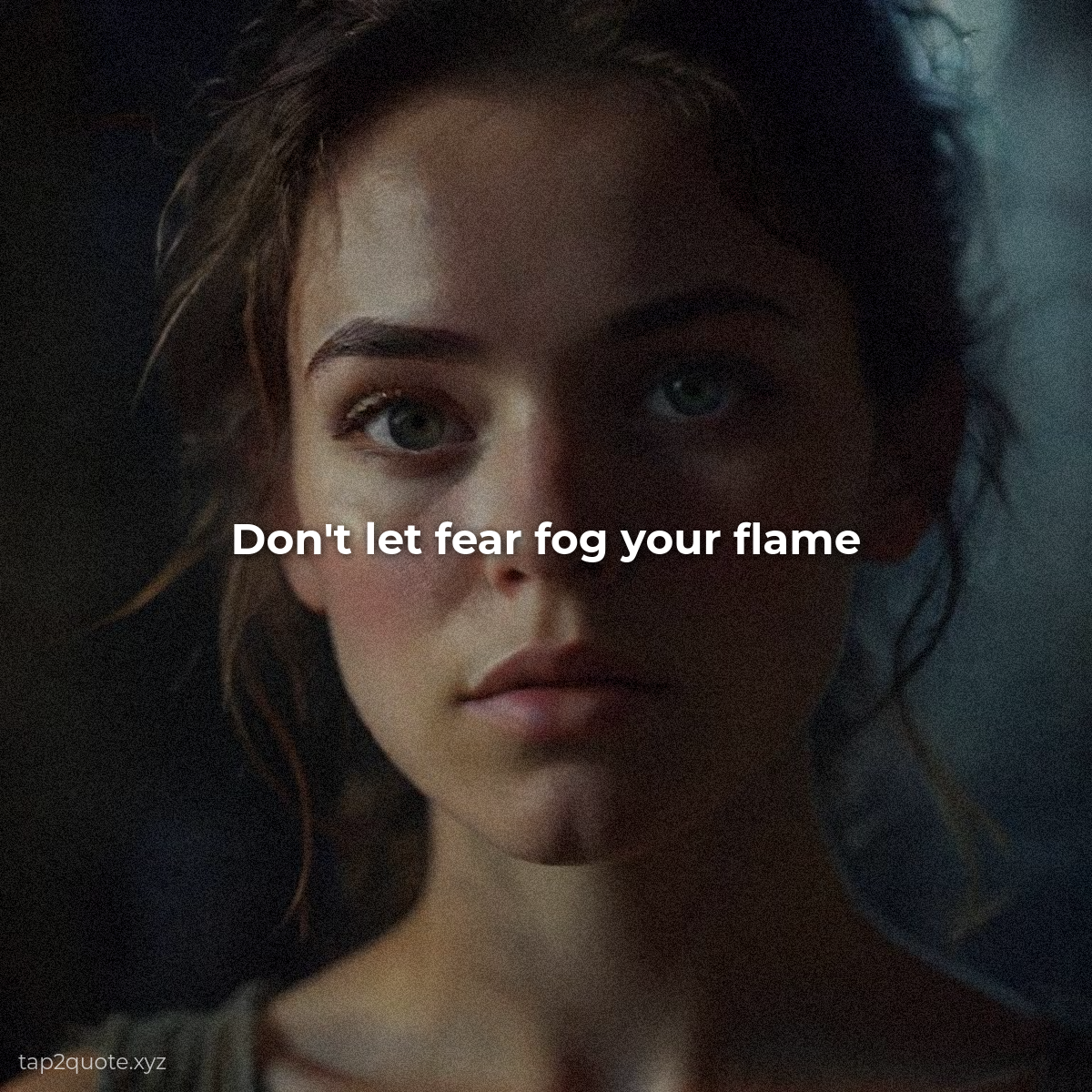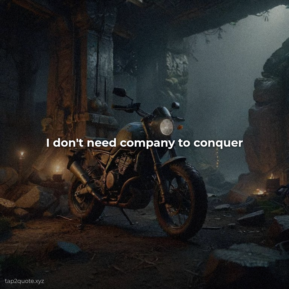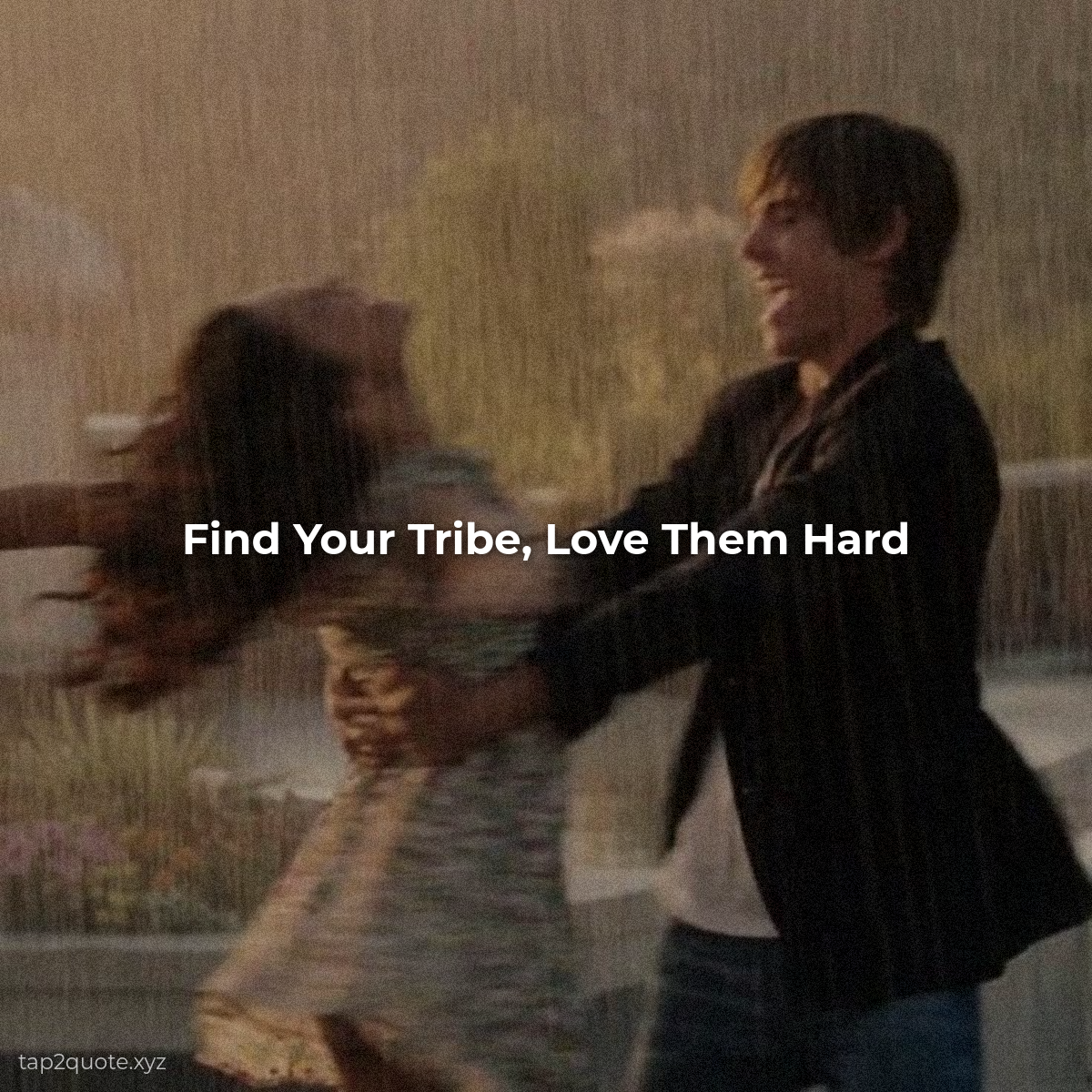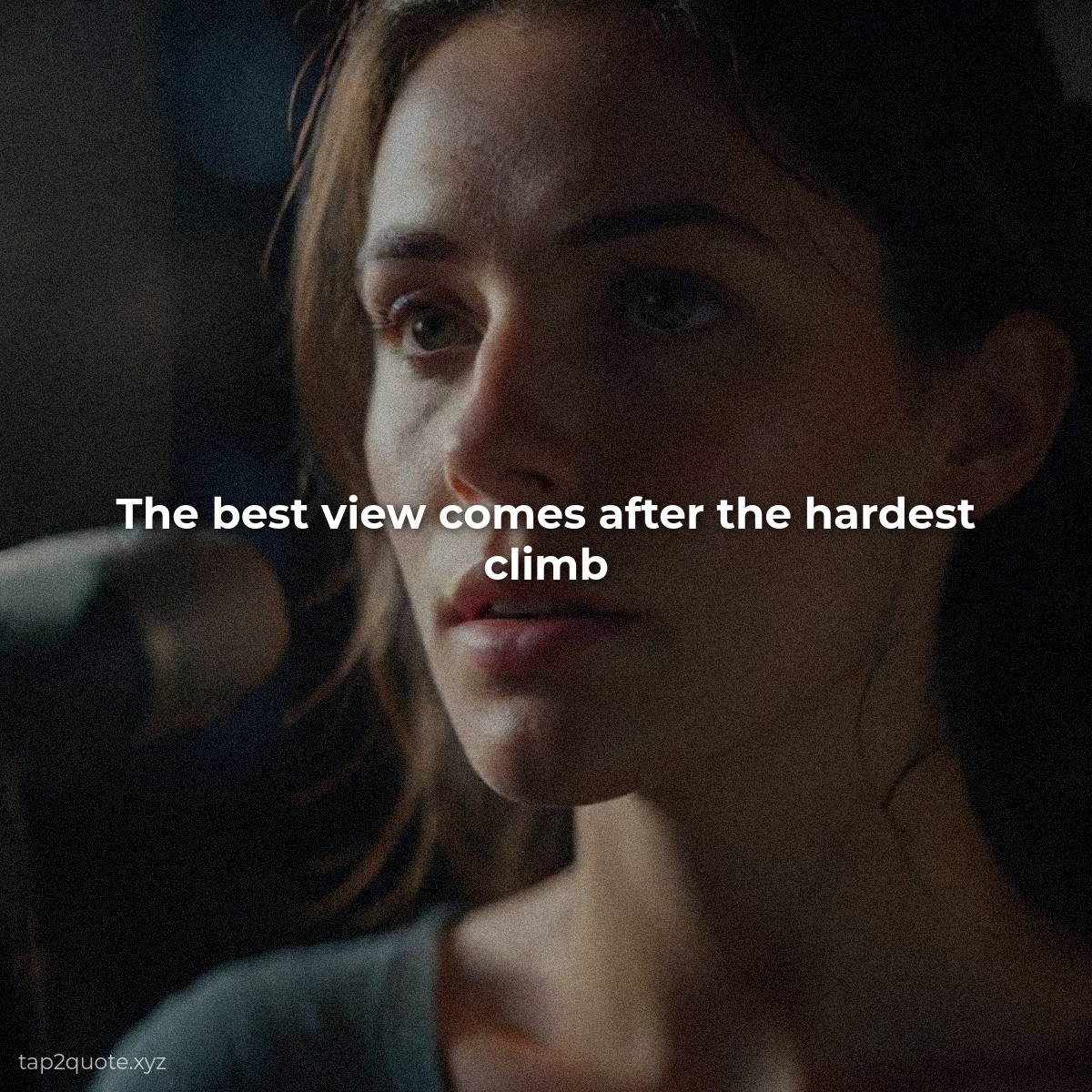
Most of the time when a quote image looks amateur, the problem is color, not design. And that's the part I resisted for a long time — I figured color was a talent you either have or you don't. It isn't. It's a handful of rules anyone can learn. These are the five that actually matter.
1. Hue, saturation, brightness — know which one is wrong
Every color has three properties. Hue is the actual color — red versus blue. Saturation is intensity — vivid versus washed out. Brightness is how light or dark. The surprise for me was that most bad color choices aren't wrong hues at all. They're saturation and brightness problems. When a color looks “off,” try lowering the saturation a little. In my experience, that's usually the whole fix.
2. Pick a temperature and stay there
Colors split into warm (reds, oranges, yellows) and cool (blues, greens, purples). Warm reads energetic and close; cool reads calm and trustworthy. Pick one temperature per image and commit. The fastest way to make a design feel unsettled is to mix them evenly.
3. Match the color to the mood of the words
People respond to colors in fairly predictable ways — blue builds trust, green signals growth, red creates urgency, yellow reads joyful, black feels powerful, purple suggests creativity. For quotes, the rule is simple: match the color to the emotion of the words. A fierce determination quote in baby blue is a mismatch no matter how pretty it looks.
4. Two or three colors, not five
Strong designs use a dominant color (the background), an accent (text or a highlight), and maybe a neutral. That's it. Everything else is noise. When you're unsure, use one color, one neutral, and let the quote be the star.
5. Contrast is the non-negotiable
All the psychology in the world is useless if nobody can read your text. Dark on light, or light on dark — every other combination is rolling the dice. I check contrast last, right before export, on every single image. It's the difference between art and a post nobody can read.
A reliable starting formula, if you want one: pick one emotion, choose the matching color at a calm saturation, pair it with a neutral, make sure your text stands out. That's maybe eighty percent of professional color decisions right there. The rest is taste — and you develop that by making a hundred images and noticing which ones feel right.